Animated card slider with Vue & GSAP - WotW
April 18, 2018
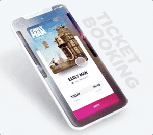
This is the third installment of the **Widget of the Week** series.
Today I’ll show you the process to make a styled card slider from scratch using Vue.
The inspiration for this widget is this and looks like this:
Preparations
Similarly to last widget, today’s widget we will be using vue.js for the interactions, and tweenlite for animations.
The HTML structure
Basically the elements of the slider are the cards and the info container, I’ll start by adding them along with some classes to be able to style them in the next step:
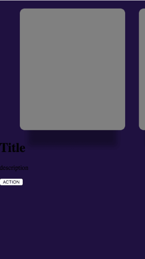
<div id="slider" class="slider"> <div class="slider-cards"> <div class="slider-card"></div> <div class="slider-card"></div> <div class="slider-card"></div> </div> <div class="slider-info"> <h1>Title</h1> <p>description</p> <button>Action</button> </div></div>Styling!
Right now it doesn’t look anything close to the final product. First I’ll simulate the mobile viewport with this rule:
.slider { overflow: hidden; background-color: #1f1140; width: 360px; height: 640px;}For the cards, I’ll be using a margin in the container to center the first card, then the cards will separate each other with a right margin. Also we need the cards container to be relative and have a z-index to be on top of the slider-info div.
The cards should be inline so they can be aside of each other, but for that too work, the container should be wide enough. Each card in this case is roughly 300px wide, so the container will be 900px wide because we have 3 cards (in case we had more cards we would need to calculate the total width needed).
Lastly we will add a box shadow to give the impression that the card floats.
.slider-cards { position: relative; width: 900px; margin: 20px 50px; z-index: 1;}.slider-card { display: inline-block; background-color: grey; overflow: hidden; width: 260px; height: 360px; margin-right: 30px; border-radius: 12px; box-shadow: 0px 60px 20px -20px rgba(0, 0, 0, 0.3);}We’re getting closer
Now it’s the turn of the slider-info to get its makeover. We will add a background color, dimensions and margins to centered the info.
It is important that it overlaps with the cards container, in order to do that, the margin-top will be negative and to compensate we add some padding-top.
We need to make sure that the overflow property is hidden to make the button at the bottom have the same rounded corners as the info container. After that is just a matter of styling the title, description and the button in the following way:
.slider-info { position: relative; overflow: hidden; background-color: white; margin-top: -200px; margin-left: 30px; padding: 200px 20px 0; width: 260px; height: 200px; text-align: center; border-radius: 8px;}.slider-info h1 { font-family: Arial Black, Gadget, sans-serif; line-height: 25px; font-size: 23px;}.slider-info p { font-family: Arial, Helvetica, sans-serif;}.slider-button { position: absolute; width: 100%; height: 50px; bottom: 0; left: 0; border: none; color: white; background-color: #e71284; font-size: 18px; font-family: Arial, Helvetica, sans-serif;}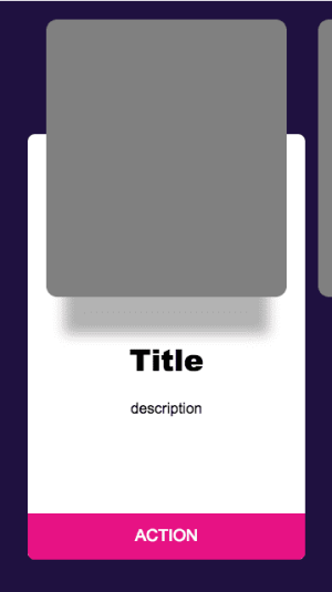
Much better.
Filling with data
We are ready to start using Vue, let’s create an instance and also set some data from The Movie DB:
new Vue({ el: "#slider", data: { slides: [ { title: "Ready Player One", description: "When the creator of a popular video game system dies, a virtual contest is created to compete for his fortune.", image: "https://image.tmdb.org/t/p/w300_and_h450_bestv2/pU1ULUq8D3iRxl1fdX2lZIzdHuI.jpg", }, { title: "Avengers: Infinity War", description: "As the Avengers and their allies have continued to protect the world from threats too large for any...", image: "https://image.tmdb.org/t/p/w300_and_h450_bestv2/7WsyChQLEftFiDOVTGkv3hFpyyt.jpg", }, { title: "Coco", description: "Despite his family’s baffling generations-old ban on music, Miguel dreams of becoming an accomplished musician...", image: "https://image.tmdb.org/t/p/w300_and_h450_bestv2/eKi8dIrr8voobbaGzDpe8w0PVbC.jpg", }, ], },});Now to be able to show the data, we need to define the default selected movie. That can be accomplished with another variable in our data called selectedIndex and a computed property that can give us the data from the slides according to that selected index:
data: { // ... slide data selectedIndex: 0 }, computed: { selectedSlide () { return this.slides[this.selectedIndex] } }Then in our template we will bind the cards with a v-for, and the info to the corresponding data:
<div id="slider" class="slider"> <div class="slider-cards"> <div v-for="(slide, index) in slides" :key="index" class="slider-card"> <img :src="slide.image" :alt="slide.title" /> </div> </div> <div class="slider-info"> <h1>{{selectedSlide.title}}</h1> <p>{{selectedSlide.description}}</p> <button class="slider-button">BOOK</button> </div></div>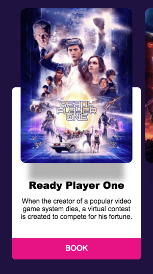
This looks almost finished, at least aesthetically, but we still need…
The interactions
If we breakdown the interactions for the slider, they are basically 3, when we press down the card, moving the card and letting the card go. To track those actions we will need to bind @mouseDown, @mouseUp and @mouseMove to methods inside the Vue instance. Also to prevent the images to ghost they should have the property draggable=false.
<div id="slider" class="slider" @mouseMove="mouseMoving"> <div class="slider-cards"> <div @mouseDown="startDrag" @mouseUp="stopDrag" v-for="(slide, index) in slides" :key="index" class="slider-card" > <img :src="slide.image" :alt="slide.title" draggable="false" /> </div> </div> <!-- slider info and the rest --></div>Now we need to create those methods in the Vue side, also we’ll add a couple of variables inside our data object:
  data: {    // ... other variables    dragging: false,    initialMouseX: 0,    initialCardsX: 0,    cardsX: 0  },  methods: {    startDrag (e) {
    },    stopDrag () {
    },    mouseMoving (e) {
    }  }
All three methods receive an event (in this case we call it e) but we will just need it in the startDrag and mouseMoving methods.
On the next code snippets I’ll break down the process step by step to fill those 3 methods, so I’ll ignore the rest of the code.
First we need to set dragging to true or false depending on the mouse actions:
startDrag (e) {  this.dragging = true},stopDrag () {  this.dragging = false},mouseMoving (e) {
}
Pretty straightforward, now we want to only be able to move our cards if we are dragging them, so inside the mouseMoving method we will add this conditional:
startDrag (e) {  this.dragging = true},stopDrag () {  this.dragging = false},mouseMoving (e) {  if(this.dragging) {
  }}
Alright now things will get interesting, we need to track what’s the position of both the cards and the mouse when we start dragging, the pageX property will tell us about the mouse position, and the cardsX inside our data will be tracking the cards’ container position:
startDrag (e) {  this.dragging = true  this.initialMouseX = e.pageX  this.initialCardsX = this.cardsX},stopDrag () {  this.dragging = false},mouseMoving (e) {  if(this.dragging) {
  }}
After storing the initial X for cards and mouse, we can deduct the target position of the cards’ container by calculating the mouse position difference when the mouseMoving method executes like this:
startDrag (e) { this.dragging = true this.initialMouseX = e.pageX this.initialCardsX = this.cardsX},stopDrag () { this.dragging = false},mouseMoving (e) { if(this.dragging) { const dragAmount = e.pageX - this.initialMouseX const targetX = this.initialCardsX + dragAmount this.cardsX = targetX }}Our component is almost ready to move, we just need to find a way to bind the cards’ container to the cardsX property, this can be done adding this property to the HTML:
...<div class="slider-cards" :style="`transform: translate3d(${cardsX}px,0,0)`"> ...</div>You might ask “Why are you using translate3d instead of just a regular 2d translate?”, the reason is that translate3d is hardware accelerated, and most of the times has a better performance. You can check by yourself in this site.
The slides are moving now, but there’s one little problem, when we let go they stay wherever we drop them, also the movie info is not changing. What we actually need is for them to find what’s the nearest slide and center it.
To find the nearest slide we just need to divide the current position with the width of the card and round the result. Then with TweenLite we will animate the cards to the corresponding position:
stopDrag () {  this.dragging = false
  const cardWidth = 290  const nearestSlide = -Math.round(this.cardsX / cardWidth)  this.selectedIndex = Math.min(Math.max(0, nearestSlide), this.slides.length -1)  TweenLite.to(this, 0.3, {cardsX: -this.selectedIndex * cardWidth})}
To understand better that formula, this gif shows how the cardsX value correlates to the nearestSlide.

And now the final result!
Right now it only works on desktop devices, but that could probably be fixed with vue-touch, you can learn more about it in this article
That’s it for the 3rd Widget of the Week.
If you haven’t checked the previous one, here it is.