Making a scrolling card list - WotW
May 23, 2018
Welcome to the Widget of the Week series, where I take gifs or videos of awesome UI/UX components, and bring them to life with code.
Today we will work on a list of cards that animate out as you scroll down. The inspiration for this widget comes from the first part of this dribble created by Hiwow and looks like this:

Preparations
For today’s widget we will just be using Vue.js, no animations library, that means we will heavily use Vue’s capabilities.
If you want to follow along you can fork this codepen template that already has the dependencies.
The initial markup
For our app to work we should have the main div with the app id where Vue.js will mount. Having done that, we can start creating the cards, in this case I will only create one because in a few moments we will programmatically create the rest.
Each card will have a placeholder image that will be next to a div that I’ll be calling the card content. This card content displays the title, description and rating data.
<div id="app"> <div class="card"> <img class="card__image" src="https://placeimg.com/100/140/animals" /> <div class="card__content"> <h3>title</h3> <p>description</p> <div class="card__rating"> <span>8.0 </span> <span class="card__stars--active">★★★</span> <span class="card__stars--inactive">★★</span> </div> </div> </div></div>For the naming of the classes you might have noticed that I’m using BEM, it will help when styling the cards in the next step.
Styling
Right now we have an image with some ugly test, let’s change that. For starters we will have a light gray background set directly into the body.
body { background-color: #fefefe;}Then for the card we will declare a predefined height, matching the image height which is 140px. Also we add some details by setting a padding, changing the font and adding a shadow to create the effect of a floating card.
.card { height: 140px; background-color: white; padding: 5px; margin-bottom: 10px; font-family: Helvetica; box-shadow: 0px 3px 8px 0px rgba(0, 0, 0, 0.5);}
We’re getting there, it’s the turn for the inner elements to be styled.
Both the card image and the card content should have a display: inline-block to be side by side. The width of the image is 100px and also has a small margin to separate it from the text, so the card content will be taking the rest of the width of the card.
The inner text of the card content needs to be aligned to the top, otherwise it won’t look the way we want to. In the case of the title, the default margin that h3 elements have is to big, so we will be setting it to 0.
The card rating container needs to be aligned to the bottom, we will use position: absolute for that to happen. Last but not least, the stars span elements will have different colors depending if a star is “active” or not.
.card__img {  display: inline-block;  margin-right: 10px;}
.card__content {  display: inline-block;  position: relative;  vertical-align: top;  width: calc(100% - 120px);  height: 140px;}
.card__content h3 {  margin: 0;}
.card__rating {  position: absolute;  bottom: 0;}
.card__stars--active {  color: #41377c;}.card__stars--inactive {  color: #cccccc;}
It should start looking more like the dribble:

If you have a keen eye, you might have notice a space difference just between the active stars and the inactive ones. This is cause by the space between the two span elements, and it can be removed like this:
...<div class="card__rating"> <span>8.0 </span> <span class="card__stars--active">★★★</span ><!-- I'm removing the space --><span class="card__stars--inactive">★★</span></div>...The behavior
Now in our Vue instance we will start declaring the data that we need to use on the component. We need a lot of cards but instead of creating each one, I just did three and copied them many times:
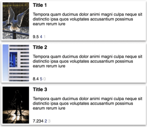
const cardsData = [ { img: "https://placeimg.com/100/140/animals", title: "Title 1", description: "Tempora quam ducimus dolor animi magni culpa neque sit distinctio ipsa quos voluptates accusantium possimus earum rerum iure", rating: 9.5, stars: 4, }, { img: "https://placeimg.com/100/140/arch", title: "Title 2", description: "Tempora quam ducimus dolor animi magni culpa neque sit distinctio ipsa quos voluptates accusantium possimus earum rerum iure", rating: 8.4, stars: 5, }, { img: "https://placeimg.com/100/140/people", title: "Title 3", description: "Tempora quam ducimus dolor animi magni culpa neque sit distinctio ipsa quos voluptates accusantium possimus earum rerum iure", rating: 7.234, stars: 2, }, // copy and paste those three items as many times as you want];Then in our Vue instance we can set the that array into the data property so we can start tracking it.
new Vue({ el: "#app", data: { cards: cardsData, },});Let’s bind that data with the HTML template. With a v-for directive we will iterate over the cards data array and render each of the properties.
<div id="app"> <div class="card" v-for="(card, index) in cards" :key="index"> <img class="card__image" :src="card.img" /> <div class="card__content"> <h3>{{card.title}}</h3> <p>{{card.description}}</p> <div class="card__rating"> <span>{{card.rating}} </span> <span class="card__stars--active">{{card.stars}}</span> <span class="card__stars--inactive">{{5 - card.stars}}</span> </div> </div> </div></div>Nice, we have a lot of cards, unfortunately the ratings and stars don’t look like we expected.
As you can notice, stars are rendering just like numbers, and the last rating is being printed with more than one decimal digit. Luckily for us, Vue.js has a something called filters that can help us to parse any data the way we want.
Let’s go back to the Vue instance and declare two filters, one will constrain the digits and the other one will convert any number to stars:
// ... data filters: { oneDecimal: function (value) { return value.toFixed(1) }, toStars: function (value) { let result = '' while(result.length < value) { result+='★' } return result } }, // ...With those filter ready to work, we can get back to the template and add them to the data we need to filter:
<!-- ... card markup --><span>{{card.rating | oneDecimal}} </span><span class="card__stars--active">{{card.stars | toStars }}</span><!-- --><span class="card__stars--inactive">{{5 - card.stars | toStars}}</span>It’s just that simple {{ value | filter }} and the data will get transformed before rendering.
Scrolling
Until now we haven’t add any behavior to our card list, we have just taken care on how it looks and renders. It’s time to animate! First we need to start tracking in some way when the app scrolls, for that we will use another Vue feature called custom directives.
This scroll directive was literally taken from the Vue.js docs and when we add it to our JS it will let us use the v-scroll directive:
Vue.directive("scroll", { inserted: function (el, binding) { let f = function (evt) { if (binding.value(evt, el)) { window.removeEventListener("scroll", f); } }; window.addEventListener("scroll", f); },});Then on our HTML a quick change in our app div will let us use it:
<div id="app" v-scroll="onScroll"> <!-- ... rest of the markup --></div>And now we should be able to create the onScroll method to start tracking the scroll position:
data: { cards: cardsData, scrollPosition: 0 }, methods: { onScroll () { this.scrollPosition = window.scrollY } },Notice that we added scrollPosition to keep track of the window.scrollY property. That will help Vue to do recalculate things when it changes.
Animating cards
In the original dribble, the cards have this disappearing effect when they start getting to the top of the screen. For that to happen we need to calculate the style of each card every time the scrollPosition updates.
The next two methods do all of the math to generate the styles. It might be a bit confusing first, but I’ll do my best to explain them.
First we set a cardHeight constant that has the value of a card including it’s padding and margin. Then taking into account the index of the card, we set to positionY the card position, the first one is 0 the second 160 then the third 320 and so on.
After that we need to know how close to the top is the card, we do it and assign the value to deltaY. We need to start animating the cards when they get to the top of the screen so we should only care when deltaY is less than 0. I clamp it between -160 and 0 because when the deltaY is less than -160 it will be already off the screen.
Finally we just create a dissapearingValue, yValue and zValue that depend on the dY value. The dissapearingValue as the name implies, will make the card fade, so we bind it to the css opacity property. The other two values will help with the transform property, making the card look like it is going behind the other cards.
  // ... methods    calculateCardStyle (card, index) {      const cardHeight = 160 // height + padding + margin
      const positionY = index * cardHeight      const deltaY = positionY - this.scrollPosition
      // constrain deltaY between -160 and 0      const dY = this.clamp(deltaY, -cardHeight, 0)
      const dissapearingValue = (dY / cardHeight) + 1      const zValue = dY / cardHeight * 50      const yValue = dY / cardHeight * -20
      card.style = {        opacity: dissapearingValue,        transform: `perspective(200px) translate3d(0,${yValue}px, ${zValue}px)`      }      return card    },    clamp (value, min, max) {      return Math.min(Math.max(min, value), max)    }
Now it’s just a matter of passing every card through that method and expose the result as a computed property called styledCards:
computed: { styledCards () { return this.cards.map(this.calculateCardStyle) } },This is almost ready, let’s bind the newly created styles into the card HTML code:
<div class="card" v-for="(card, index) in styledCards" :style="card.style" :key="index"></div>And now the final result (remember to scroll down):
That’s it for this Widget of the Week.
If you’re hungry for more you can check other WotW: