Cards hover animation - WotW
June 19, 2018
Welcome to the Widget of the Week series, where I take gifs or videos of awesome UI/UX components, and bring them to life with code.
I’ve been quite busy for a couple of weeks, preparing and giving a Vue.js course in Wizeline Academy, but I’m back with another interactive component.
Today we’ll make a list of cards that animate when hovered (or clicked in mobile), the inspiration comes from this dribble created by Kreativa Studio and looks like this:

Preparations
For today’s widget we will be using Vue.js, and for some specific animations we’ll use the TweenMax.
If you want to follow along you can fork this codepen template that already has the dependencies.
The initial markup
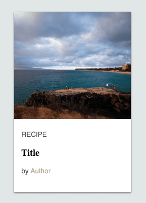
For this component I’ll start by making a single card. It will be divided in two parts: the image and the footer with the text elements. Also for each element I’ll set a specific class so we can style it later.
<div id="app">  <div class="card-row">    <div class="card">      <img class="card-image" src="https://placeimg.com/640/480/nature" />
      <div class="card-footer">        <p class="card-text">RECIPE</p>        <h3 class="card-title">Title</h3>        <p class="card-text">          by          <span class="card-author">Author</span>        </p>      </div>    </div>  </div></div>
At this point we should only have a big image and some text below.
Styling
Before doing anything else we need to make the card look like the reference in order to handle any needed animation.
First I’ll match the body background color, then int the card-row I’ll make use of flex, the justify-content property and align-items to center the content, in this case the cards.
body {  background-color: #e1e7e7;}
.card-row {  display: flex;  justify-content: center;  align-items: center;  min-width: 780px;  width: 100%;  height: 500px;}
Now let’s style the card. The position will be set to relative to be able to position the footer element and stick it to the bottom. Also we set the overflow property to hidden to be able to resize the background image without it getting outside the card.
.card { position: relative; background-color: #ffffff; height: 370px; width: 240px; margin: 10px; overflow: hidden; box-shadow: 0px 2px 4px 0px rgba(0, 0, 0, 0.5);}For the image I set the position to absoulte and the left and right properties to -9999px, that trick should center the image horizontally even when we animate it’s width.
.card-image {  /* center horizontally overflown image */  position: absolute;  left: -9999px;  right: -9999px;  margin: auto;
  height: 220px;  min-width: 100%;}
Last but not least, we need to style the footer and it’s contents. For that position: absolute and bottom:0 should keep the container at the bottom. The rest are just rules to make the elements look a little bit like the reference.
.card-footer { position: absolute; bottom: 0; height: 130px; padding: 10px 15px; font-family: Helvetica;}.card-text { font-size: 14px; color: rgba(0, 0, 0, 0.7);}.card-title { font-family: Serif;}.card-author { font-size: 14px; color: #bab096;}After that we should have something like this:
The behavior
For the next steps we will need more than a single card, so let’s declare the data for at least three cards.
const cards = [ { title: "Gooey PBJ Brownies", author: "John Walibur", image: "https://placeimg.com/640/480/nature", }, { title: "Crisp Spanish Tortilla Matzo Brei", author: "Colman Andrews", image: "https://placeimg.com/640/480/animals", }, { title: "Grilled Shrimp with Lemon and Garlic", author: "Celeste Mills", image: "https://placeimg.com/640/480/arch", },];Then let’s create the Vue instance and bind to it’s data the cards data and declare a variable to track the current card:
new Vue({ el: "#app", data: { cards: cards, selectedCard: -1, },});And now in our template we can render those cards with a v-for directive like this:
<div id="app">  <div class="card-row">    <div      v-for="(card, index) in cards"      :key="index"      :ref="`card_${index}`"      @mouseover="hoverCard(index)"      @mouseout="hoverCard(-1)"      class="card"    >      <img class="card-image" :src="card.image" />
      <div class="card-footer">        <p class="card-text">RECIPE</p>        <h3 class="card-title">{{card.title}}</h3>        <p class="card-text">          by          <span class="card-author">{{card.author}}</span>        </p>      </div>    </div>  </div></div>
You might have noticed that I binded a couple of events @mouseover and mouseout. Both are triggering a method called hoverCard that we have not declared yet, so let’s do that.
// ... vue instance methods: { hoverCard(selectedIndex) { this.selectedCard = selectedIndex }, isSelected (cardIndex) { return this.selectedCard === cardIndex } }Make the hover effect
We will make use of that selectedCard property and also the isSelected method to set a class to the elements we are going to animate, but first let’s add some simple CSS transitions for the whole card.
.card { /* the other rules */ transition: height 0.3s, box-shadow 0.3s;}.card:hover { height: 410px; box-shadow: 20px 20px 40px 0px rgba(0, 0, 0, 0.5);}By adding the transition line in the .card we are indicating that the height and box-shadow should be animated, then when the card is hovered, its height will increase along with the shadow to make it look like it is getting closer to us.
Now we’ll use the isSelected method to set the .selected card to the image. I’m not using :hover in this case, because the user can be hovering the text and we still want the image animation to run, not only when the image is hovered.
<!-- card markup --><img class="card-image" :class="{'selected': isSelected(index)}" :src="card.image"/>And just like we did with the card let’s add a transition and a .selected state:
.card-image { /* the other rules */ transition: height 0.3s, opacity 0.3s;}.card-image.selected { height: 410px; opacity: 0.3;}The image will change it’s size when hovered and we only need to set the height because the width will automatically adjust to keep the aspect ratio.

Now that the image is expanding, I feel that the author text is too bright and can’t be read clearly. I’ll just repeat the lasts steps to make it look darker when the card is hovered:
<!-- card --><!-- card-footer --><span class="card-author" :class="{'selected': isSelected(index)}"> {{card.author}}</span>.card-author { /* the other rules */ transition: color 0.3s;}.card-author.selected { color: #6a6456;}Separate the other cards
We are almost there, but there’s still something missing. In the reference, when the card is hovered the other cards move away from it, like a repelling effect.
That effect can’t easily be done with just CSS, we will need to do the animation by calculating where each card should move and then animate it with TweenMax.
I’ll create a new method called animateCards that will be triggered when the selectedCard changes.
Then for each of the cards we need to know in which direction should they move.
- First when no card is selected everything should stay the same
direction = 0. - When a card is before the selected card it should move to the left
direction = -1. - If the card is after the selected card it must move to the right
direction = 1. - Finally if the card is the selected one, it should not move
direction = 0.
// methods    hoverCard(selectedIndex) {      this.selectedCard = selectedIndex      this.animateCards()    },    animateCards () {      this.cards.forEach((card, index) => {        const direction = this.calculateCardDirection(index, this.selectedCard)        TweenMax.to(          this.$refs[`card_${index}`],          0.3,          {x: direction * 50}        )      })    },    calculateCardDirection (cardIndex, selectedIndex) {      if(selectedIndex === -1) {        return 0      }
      const diff = cardIndex - selectedIndex      return diff === 0 ? 0 : diff/Math.abs(diff)    },
After calculating the direction, with the help of this.$refs we can select each card and make TweenMax change it’s position.
And now the final result!
That’s it for this Widget of the Week.
If you’re hungry for more you can check other WotW:
Also if you want to see a specific widget for next week, post it in the comments section.