How I made a smiley toggle control — WotW
April 4, 2018
This is the first post of a series called **Widget of the Week**.
As the name implies I’ll be creating every 7 days a widget based mostly on dribbles from UI Movement.
Transforming a gif to a full working HTML control is not as easy as it sounds, so I’ll be also writing about the process and explaining the reason behind the solution for the tricky parts.
Without further ado, this week widget is this toggle control:
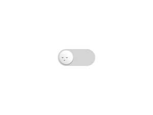
Preparing the elements
First we need to identify the parts of the widget, at first sight it looks like we need a container for the control, a background, the ball, and the faces inside the ball.
Almost everything can be done with HTML + CSS. The faces could be done with some CSS magic but I thought it would be easier to fire up an app and create SVG nodes for them. I just took a screen shot and redraw them:

We have now everything to start coding.
The HTML structure
The basic structure started to look like this:
<div id="widget" class="center">  <div class="toggle-container">    <!-- background -->    <div class="toggle-bg"></div>
    <div class="ball-face">      <div class="faces-container">        <div class="faces-together">          <!-- happy face svg -->          <svg class="happy-face" ... />          <!-- sleepy face svg -->          <svg class="sleepy-face" ... />        </div>      </div>    </div>  </div></div>
Then I started to add some style to them, I used border radius for both the background and the ball-face, gradients and box-shadow helped to give volume to the sphere. Also I had to set the -webkit-tap-highlight-color to remove the highlight that appears when you tap on mobile. Then after some trial an error, I positioned the faces SVG.
.center { margin-left: calc(50% - 75px); margin-top: 50px;}.toggle-container { position: relative; cursor: pointer; margin: 20px 0; outline: 0; -webkit-tap-highlight-color: rgba(0, 0, 0, 0);}.toggle-bg { background: #d4cfd0; width: 150px; height: 70px; border-radius: 50px;}.ball-face { position: absolute; overflow: hidden; left: 7px; top: 7px; width: 56px; height: 56px; border-radius: 50%; background: linear-gradient(45deg, #c6c6c6 0%, #ffffff 60%); box-shadow: -1px 3px 8px 0px rgba(0, 0, 0, 0.2);}.faces-container { position: relative;}.faces-together { position: absolute; left: 0;}.happy-face { position: absolute; top: 18px; left: -120px; width: 25px;}.sleepy-face { position: absolute; top: 27px; left: 10px; width: 25px;}The interaction logic
To make the control work we need some JS code, so I imported Vue.js to quickly integrate the functionality.
Something like this is enough to start:
var widget = new Vue({ el: "#widget", data: { active: false, }, methods: { toggle() { this.active = !this.active; }, }, computed: { isChecked() { return this.active ? "true" : "false"; }, },});Now, we just need to bind the toggle method to our toggle control inside the HTML like this:
<div id="widget" class="center"> <div @click="toggle" class="toggle-container">] // ... rest of html</div></div>At the moment there won’t be any visual changes, but if we inspect into the component it is already working, toggling the active property on each click. So the next thing to do is change the appearance depending on that property.
Binding CSS classes to Vue property
First I needed to create the CSS rules that would be applied when the toggle is ‘active’ so I started creating classes like
.ball-face.active { left: 87px;}That will move to the right the ball-face immediately, so we need a transition inside our already created .ball-face class:
.ball-face { ... other rules transition: left 0.4s ease-in-out;}That will animate the property ‘left’ in 0.4 seconds with a change of acceleration (ease) of type ‘in-out’. If you want to know more about transitions in CSS and what easing is, you can check this page.
After that we need to somehow append the ‘active’ class to the HTML when the Vue property is true, to do so we need to bind the class like this:
<div :class="{'active': active}" class="ball-face"></div>Notice the colon in :class that helps binding the Vue properties to show or hide the ‘active’ class. That class will append to the already defined class ‘ball-face’.
Now I tried to do the same for the rest of the properties. The only problem I had was when trying to animate the background color for the container background, it looks like CSS transitions don’t support that property yet. I had to do a work-around by having two backgrounds, a gray one and the colorful one one above the other. Instead of transitioning the color I just needed to animate the opacity.
For the faces I animated the left property too, then in the ball I put overflow: hidden; to mask the content. This is how it looks without the masking:

Accessibility
Our component has the functionality of a checkbox, so according to the MDN webdocs if we want to make it accessible we need to add a couple of properties. Also it mentions that the ‘space’ button is expected to toggle the control and I thought that the ‘Enter’ key should toggle it too, so I ended up with these bindings:
<label for="toggleControl">Click the sleepy face!</label><div @click="toggle" @keyup.space="toggle" @keyup.enter="toggle" :aria-checked="isChecked" class="toggle-container" role="checkbox" tabindex="0" id="toggleControl"> ... rest of html</div>And now the final result!
That’s it for the first Widget of the Week, if you want to see a specific widget for next week, post it in the comments section.
See you next week!