Making a 3D facing widget - WotW
July 4, 2018
Welcome to the Widget of the Week series, where I take gifs or videos of awesome UI/UX components, and bring them to life with code.
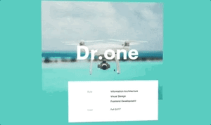
This time we are going to create a 3D widget that “looks” at the cursor as we move it through the screen. The inspiration comes from this dribble created by Steven Hanley and looks like this:
Preparations
For today’s widget we will be using Vue.js, and for the “look around” animation we’ll use TweenMax.
If you want to follow along you can fork this codepen template that already has the dependencies.
The initial markup
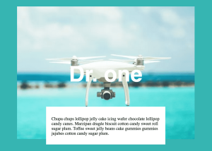
For this component the markup should be really simple. We need our app, a container, and inside it an image, title and a card with some random text.
<div id="app"> <div class="container center"> <img class="image" src="https://www.dropbox.com/s/b0h57o6sxznnowy/drone-00.webp?raw=1" /> <h1 class="title">Dr. one</h1> <div class="card"> <p> Chupa chups lollipop jelly cake icing wafer chocolate lollipop candy canes. Marzipan dragée biscuit cotton candy sweet roll sugar plum. Toffee sweet jelly beans cake gummies gummies jujubes cotton candy sugar plum. </p> </div> </div></div>As you might have noticed, we already added some classes in order to style each node in the next step.
Styling
First of all, to match the reference background we will simply put the following rule:
body { background-color: #36b5b2;}Next we will center the container and also add some upper margin so it has some moving space on top.
.container {  position: relative;  margin-top: 40px;}
.center {  display: flex;  align-items: center;  justify-content: center;}
The position: relative property will let us manipulate the inner elements with absolute positioning without them getting outside the original container (unless we want them to do that).
The title will be centered horizontally and slightly bellow the vertical center (top: 150px) and we will try to match the font size and family.
.title { position: absolute; top: 150px; text-align: center; color: white; font-size: 80px; font-family: Helvetica, Arial, Sans-Serif;}Then the card will be similarly positioned in the horizontal center, but this time it will be bellow the image by a bit (bottom: -20px), and have a fixed height and width:
.card { position: absolute; background-color: white; bottom: -20px; padding: 20px; width: 400px; height: 100px;}After that we should have something like this:
The behavior
Before we start coding the Vue app, let’s analize what we need to achieve the desired animation, let’s take a look again to the reference:

Our input in this case will be the mouse position, depending on it we should change the rotation of the container. This rotation should be controlled as we don’t want the object to rotate 360 degrees, it actually rotates just enough to get the feeling that it faces the mouse, I’d say around 20 degrees in each direction.
Now we can setup our Vue app with that knowledge, let’s declare a constant with the degrees of freedom and also a couple of data properties to keep track of the object rotation:
const maxRotationDegrees = 20;new Vue({ el: "#app", data: { rotX: 0, rotY: 0, },});The next step is to add a method to follow the mouse position, we want to know its position everywhere in our app, not just the widget, so we need to add a mousemove handler in the main HTML node like this:
<div id="app" @mousemove="mouseMoved"> <!-- the rest of the markup --></div>The mouseMoved method needs to be created, inside it we will get the mouse position with the pageX and pageY properties of the event. After that we will normalize the inputs, multiply that by the degrees of freedom and finally store them into our rotX and rotY properties:
// vue app ...  methods: {    mouseMoved (e) {       // This gives us a number between -1 and 1       const mousePercX = (e.pageX / document.body.clientWidth) * 2 - 1       const mousePercY = (e.pageY / document.body.clientHeight) * 2 - 1

       this.rotX = mousePercX * maxRotationDegrees       this.rotY = mousePercY * -maxRotationDegrees    }  }
To start seeing some movement in our widget we need to change the style of it, so we will create a computed property called rotation that will generate the CSS transform to be applied to the widget:
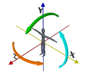
// vue app ... computed: { rotation () { return { transform: `perspective(1000px) rotateY(${this.rotX}deg) rotateX(${this.rotY}deg)` } } },You might have noticed that we have the rotateY property with the rotX property, and something similar with the rotateX, this is not a mistake.
What happens is that when rotating an object in a 3D space, the rotation in the Y axis makes and object change its facing direction horizontally and the rotation in the X axis does it vertically.
You can see it more clearly in the next image, the orange arrow corresponds to the rotateY property and the green one is the rotateX property:
With that explained, we can now add those transforms to our widget in an inline style property, like this:
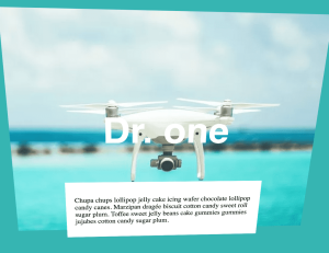
<!-- app --><div class="container center" :style="rotation"></div>If we test that we should see the widget moving… but something is not right, the object is completely flat:
Even though we are adding a perspective property in the computed rotation, we still need to change the z position of the inner parts. It should look like the image is behind, the title is in the middle and the card is in front, so let’s change their CSS a bit:
.image {  transform: translateZ(-100px);}
.title {  /* other props */  transform: translateZ(20px);}
.card {  /* other props */  transform: translateZ(100px);}
Mmmh still looking flat…
After reading some documentation I found out that the children of a node are always flat, unless you explicitly say otherwise, so we need to add the following property in our container:
.container { /* other props */ transform-style: preserve-3d;}That will allow the children of the node to render in 3D space correctly.
We could say we are done, but I feel that the animation is a bit stiff. We can smooth it by replacing the last part of the mouseMoved method with a tween like this:
// mouseMoved...// remove these// this.rotX = mousePercX * maxRotationDegrees// this.rotY = mousePercY * -maxRotationDegrees
// add thisTweenLite.to(this, 0.5, {  rotX: mousePercX * maxRotationDegrees,  rotY: mousePercY * -maxRotationDegrees,});
And now the final result!
That’s it for this Widget of the Week.
If you’re hungry for more you can check other WotW: