How I made a fluid layout component - WotW
May 9, 2018
Welcome to the Widget of the Week series, where I take gifs or videos of awesome UI/UX components, and bring them to life with code.
Today I’ll be doing a component that changes the width of a two column layout when a button is clicked. The inspiration for this widget comes from this submission and looks like this:
Preparations
Like I’ve been doing before, we will be using Vue.js for the interactions and the GSAP platform for animations. If you use something like codepen you can find them in the libraries.
The basic markup
For this component I’ll be simplifying the content of it, I won’t add any text and we will work only with a left pane, right pane and the action button:
<div id="app"> <div class="container"> <div class="left-pane"></div> <div class="right-pane"></div> </div> <div class="action-btn">+</div></div>Don’t get deceived by the simplicity of it, because that means that the CSS and JS will be doing the heavy lifting today.
Styling
Let’s start styling the parts of our component, but first some initial css setup on the body of our HTML:
body { margin: 0; padding: 0;}Now we will define a height on our container for our panes to have some volume. On the left pane we will have a solid color and on the right one we will set an centered background image that covers the entire pane. For the image I will use a placeholder from placeimg but it can be anything you want:
.container {  height: 600px;}.left-pane {  display: inline-block;  background-color: #307490;  width: 30%;  height: 600px; /* should match containers height */}.right-pane {  display: inline-block;  width: 70%;  height: 100%;  height: 600px; /* should match containers height */
  background-image: url("https://placeimg.com/1000/600/nature");  background-size: cover;  background-repeat: no-repeat;  background-position: 50% 50%;}
We have two inline-blocks now, one with 30% width and the other one with 70% so they should go side by side right?
Wrong! they look like this:
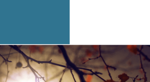
So why is that happening? Believe it or not, there’s a small space between both panes cause by our own markup. Basically 30% + small-space + 70% is greater that 100% and causes the last element (right pane) to go down.
But where exactly is this space? Right here:
<div class="left-pane"></div><div class="right-pane"></div>Maybe you don’t see it but is there, let me remove it so you can see what I’m talking about:
<div class="left-pane"></div><!-- this comment removes the space --><div class="right-pane"></div>Now you see it, if you want you can just put together both panes in the same line but I find that this “comment” approach is more readable.
Now let’s style the button that will change the layout. For that we need it to be positioned absolutely so it can be on top of both panes, also I’m using border-radius to make it a circle, some rules to have white and centered text and finally cursor: pointer so it looks clickable when hovered:
.action-btn { position: absolute; width: 50px; height: 50px; left: calc(30% - 25px); /* width of first pane - half circle */ top: 300px; border-radius: 50%; background: black; color: white; font-size: 40px; text-align: center; cursor: pointer;}We’re almost done on the CSS side, we just need to prepare for transitions. Our panes will be changing their width so we need an animation for that:
.right-pane,.left-pane { transition: width 0.7s;}And lastly when they open we will be adding a .open class that should change their width, for that we need these two rules:
.left-pane.open { width: 70%;}.right-pane.open { width: 30%;}It’s looking better now.

The interactions
To start programming the behavior of our component we need to create the Vue instance. After that we will just declare a data property called open to keep track of the state of our panes, and also we declare a method toggle to change the open property:
new Vue({ el: "#app", data: { open: false, }, methods: { toggle() { this.open = !this.open; }, },});Pretty straight forward right? Now we need to bind it to our HTML for it to work. We will add a class binding on both panes so the open class gets added when the open property is true, and after that bind the button click to the toggle method like this:
<div id="app"> <div class="container"> <div class="left-pane" :class="{'open': open}"></div> <!-- this comment removes the space --> <div class="right-pane" :class="{'open': open}"></div> </div> <div @click="toggle" class="action-btn">+</div></div>If everything went well we should have our panes animated when clicking the button.
Here comes the tricky part, our button needs to be animated too to match what we saw before. To be able to reference our button directly lets put a ref in the following way:
...<div @click="toggle" ref="actionbtn" class="action-btn">+</div>...With that we will be able to reference the actionbtn inside our JS. At this moment our button is clickable all the time, to avoid double clicks we need an animating data property that will help us to run our toggle function only when the button and panes are not animating.
//...  data: {    open: false,    animating: false  },  methods: {    toggle () {      if(this.animating) {        // avoid any action if button clicked when animated        return      }
      this.open = !this.open      this.animateButton()    }  }//...
We just added an animating button method call inside the toggle method, so let’s create it. In it we will set animating to true and then make our button disappear using TweenMax:
//... methods    animateButton () {      this.animating = true
      // animate out      const propsOut = {        scale: 0, // make it disappear        ease: Back.easeIn,        onComplete: this.animateIn // this function will be called when animation finishes      }      TweenMax.to(this.$refs.actionbtn, 0.2, propsOut)
    },
On the line ease: Back.easeIn we declare what kind of easing animation we will use, for reference you can check all the available options in GSAP ease visualizer. Also notice that we use this.$refs.actionbtn to reference our button and start animating it.
The animateIn function that we call after the disappearing animation ends is really similar, we will just need a computed property to know where our button should appear depending on the open state:
//... methods    animateIn () {      //set new position      TweenMax.set(this.$refs.actionbtn, this.actionBtnPosition)
      const propsIn = {        delay: 0.4,        scale: 1,        ease: Back.easeOut,      }      TweenMax.to(this.$refs.actionbtn, 0.2, propsIn)    },  }  computed: {    actionBtnPosition () {      const perc = this.open ? '70%' : '30%'      const top = this.open ? '200px' : '300px'      return {        top: top,        left: `calc(${perc} - 25px)`      }    },  }//...
Animation is almost ready, we just need to make the plus sign change to a close symbol. In our reference gif, they manage to do that by rotating the button and we will do the same.
Just after the code that makes the button appear we need to add a tween that changes the rotation. Also when everything finishes we can set animating back to false so we can click the button again:
//... methods////... animateIn const propsRotation = { delay: 0.4, rotation: this.actionBtnRotation, onComplete: this.endedAnimating } TweenMax.to(this.$refs.actionbtn, 0.3, propsRotation) }, endedAnimating () { this.animating = false }//... computed actionBtnRotation () { return this.open ? -135 : 0 }//...And that’s it, this is the final result!
If you’re hungry for more you can check other WotW: