How to make an animated "Wizard" component - WotW
April 25, 2018
Welcome to the Widget of the Week series, where I take gifs or videos of awesome UI/UX components, and bring them to life with code.
This week is the turn for a progress indicator or “Wizard” component, that can help you with the on-boarding process of your app. The inspiration comes from this UI movement submission and looks like this:

Preparations
For this widget I’ll be using Vue.js for the interactions and Sass for styling.
The basic markup
As usual I like to start with the markup that I’ll be needing for the component. We will need a root div with id="app" so we can later mount our Vue app.
Inside it should be a container with the progress elements (the background, the bar and the ball), and also the cards with the steps to follow.
You’ll notice in the code bellow, that the cards have 3 states: done, active and normal, those classes will help us with the styling in the next step.
<div id="app">  <div class="container">    <div class="progress-bg"></div>    <div class="progress-bar"></div>    <div class="progress-ball"></div>
    <div class="card done">      <h3>Title 1</h3>      <p>Description</p>    </div>
    <div class="card active">      <h3>Title 2</h3>      <p>Description</p>    </div>
    <div class="card">      <h3>Title 3</h3>      <p>Description</p>    </div>
    <div class="card">      <h3>Title 4</h3>      <p>Description</p>    </div>  </div></div>
Styling
We will start to match the background color and the main container. I used the grid display property to have better control over the layout and the items, if you want to know more about it you can check this guide. For better understanding I added inline comments clarifying key decisions:
body { background-color: #b5ab9e;}.container { position: relative; // used to contain absolute positioned elements display: grid; overflow: hidden; // helps hiding inner elements that exceed size border-radius: 5px; // rounded corners grid-template-columns: 1fr 1fr 1fr 1fr; // here are declared the 4 columns for the 4 cards width: 700px; box-shadow: 0px 20px 26px -10px rgba(0, 0, 0, 0.5);}Now we need to style the progress elements, they will be absolute positioned so they don’t get in the way of the cards. Also I will declare a couple of scss variables for the color and height of the progress elements.
$bar-height: 60px; // aligns all progress elements$bar-color: #b52a1c; // dark red color
.progress-bg {  position: absolute;  top: $bar-height;  width: 100%;  height: 5px;  background-color: rgba(0, 0, 0, 0.1); // black with 10% opacity}.progress-bar {  position: absolute;  top: $bar-height;  width: 35%;  height: 5px;  background-color: $bar-color;  transition: width 0.3s; // we will animate the width property}.progress-ball {  position: absolute;  top: $bar-height - 3; // subtracting half of the ball radius  left: calc(35% - 6px); // and the ball radius, to center it  border-radius: 50%; // makes the circle  background-color: $bar-color;  width: 12px;  height: 12px;  transition: left 0.3s, opacity 0.3s; // we will animate the left and opacity property}
After that, to style the cards, we will make a general card rule and special rules for the done and active cards:
.card {  padding: 0 10px;  background-color: #fcf6ee; // beige color  color: rgba(0, 0, 0, 0.3); // Text color is black with 30% opacity  font-family: Arial, Helvetica, sans-serif;  height: 200px;  transition: background-color 0.3s, color 0.3s; // We will animate its bgColor and color props  p {    margin-top: 45px;  }}.card.done {  background-color: #c13326; // change bgColor to dark red  color: rgba(    255,    255,    255,    0.6  ); // the text color will change to white with 60% opacity}
.card.active {  color: rgba(    0,    0,    0,    0.6  ); // the active card only has a darker text (more opacity)}
And now we have something like this:

The interactions
We have a pretty component but it doesn’t have any actions, let’s start by initializing Vue in our #app and adding some basic data for our cards:
const cards = [  {    title: "Phase 01",    description: "Project research and main component specifications.",  },  {    title: "Phase 02",    description: "Initial project requirements and initialization.",  },  {    title: "Phase 03",    description: "Design and basic bootstrap for all elements.",  },  {    title: "Phase 04",    description: "Final testing on various devices and platforms.",  },];
new Vue({  el: "#app",  data: {    currentStep: 0, // here we will track the current card    cards: cards,  },});
Before binding that data to our HTML cards, first we need a way to generate the classes .done and .active. Let’s make a method to compare the currentStep to each card and return the corresponding class:
  // ...  methods: {    getCardClass(cardIndex) {      if(cardIndex===this.currentStep) {        return 'active'      }      if(cardIndex<this.currentStep) {        return 'done'      }
      return ''    }  }
Now we can replace the cards with the next snippet that uses v-for to iterate over our data and will set the corresponding class to each one:
...<div v-for="(card, index) in cards" :key="index" class="card" :class="getCardClass(index + 1)"> <h3>{{card.title}}</h3> <p>{{card.description}}</p></div>...You can manually change the currentStep data to se how the cards change, but it will be better to have a way to change it quicker, in the JS I’ll add a computed property and these two methods:
  computed: {    totalSteps () {      return this.cards.length    }  },
  // ... methods    goPrev() {      if(this.currentStep>0){        this.currentStep--      }    },    goNext() {      if(this.currentStep<=this.totalSteps){        this.currentStep++      }    }
and then in our HTML (outside the container) we can add a couple of buttons and a paragraph to display the currentStep:
...<div class="buttons"> <button @click="goPrev">Prev</button> <button @click="goNext">Next</button> <p>step: {{currentStep}}</p></div>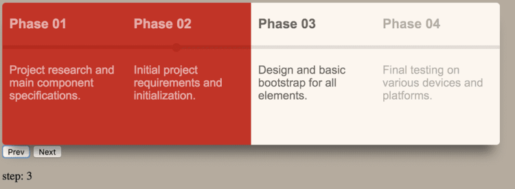
Looks almost done, but the progress bar is not moving yet.
We actually don’t need to do something with the progress background, but the progress bar needs to change its width and the ball its left position.
Those are just style changes so it is a matter of just a couple of bindings like this:
<div :style="barStyle" class="progress-bar"></div><div :style="ballStyle" class="progress-ball"></div>The barStyle and ballStyle will be computed properties because they will change depending on the currentStep and the number of cards.
We will start with the barStyle, it just needs to returns an object with a width property, thanks to the binding that will be changes to inline styles.
The tricky part here is how that width needs to be calculated, because it depends on the number of cards:
// computed    barStyle () {      return {        width: this.barWidth      }    },    barWidth () {      const step = (100 / this.totalSteps)      const stepHalf = step / 2
      // sets width to match the center of the card      const target = (step * this.currentStep) - stepHalf      // keep width between 0 - 100      const width = Math.max(Math.min(target, 100), 0)      return `${width}%`    }
On the line where we assign the target value, if we didn’t subtract the stepHalf it would set the bar at the end of the card instead of the middle.
Now for the ball style, we can reuse the barWidth property and just center the circle like we did before in the CSS.
// computed ballStyle () { const isVisible = this.currentStep && !this.allStepsDone const opacity = isVisible ? 1 : 0 return { left: `calc(${this.barWidth} - 6px)`, opacity: opacity, } }, allStepsDone() { return this.currentStep>this.totalSteps }Notice that when the currentStep is 0 or the last step allStepsDone, we just make the circle disappear by setting its opacity to 0.
The progress bar should be working by now, but our work is not done, if we look close to the original animation it has different colors for each “done” card. Using an array with all the possible shades of color a card can get is not practical, instead I used HSL colors.
HSL stands for Hue, Saturation and Lightness. Colors in this format can be declared like this hsl(0, 100%, 50%) // red.
Let’s declare the base color at the beginning of our js:
const hslColorRed = { h: 5, s: 67, l: 45,};Now similar to the getCardClass method, we will create a getCardColor one. In there we will check first if the step is done and then depending on how close to the currentStep it is, we will add more lightness to the base color:
// methods    getCardColor(cardIndex) {      // step not done yet      if(cardIndex>=this.currentStep) {        return      }
      const {h,s,l} = hslColorRed      if(this.allStepsDone){        // return the base color when all steps are done        return {          backgroundColor: `hsl(${h}, ${s}%, ${l}%)`        }      }
      const lightnessRange = 15      const step = (lightnessRange / this.currentStep) * cardIndex      const newL = l + step      return {        backgroundColor: `hsl(${h}, ${s}%, ${newL}%)`      }    },
And now the final result!
That’s it for today’s Widget of the Week.
If you’re hungry for more you can check other WotW: