Making an animated slider - WotW
July 12, 2018
Welcome to the Widget of the Week series, where I take gifs or videos of awesome UI/UX components, and bring them to life with code.
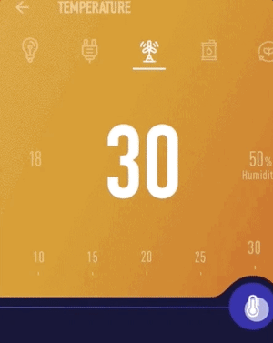
This time we are going to create a temperature slider, although it can be used for anything. The inspiration comes from this submission created by ramykhuffash and looks like this:
Preparations
For today’s widget we will be using Vue.js, and for some animations we’ll use TweenMax. Also we will need a temperature icon, so we’ll be using the one from Font Awesome.
If you want to follow along you can fork this codepen template that already has the dependencies.
Matching the design
The HTML markup for this widget got a little bit more complicated than the usual, so this time I will break it down in sections using HTML + CSS until we match the original design.
Let’s start by setting an upper and lower section, the upper one will contain the numbers and the lower one the slider control.
<div id="app" class="main-container"> <div class="upper-container"></div> <div class="lower-container"></div></div>Before styling them we need a couple of main CSS properties in the body.
body { margin: 0; color: white; font-family: Arial, Helvetica, sans-serif;}We set the margin to 0 to avoid having a gap surrounding our main-container. The color and font-family is set there too to avoid repeating them all over our elements.
Now we will use CSS grid properties to divide the screen in two parts, the upper one needs to take something like 3/4 of the vertical height, we can achieve that with fr.
.main-container { display: grid; grid-template-columns: 1fr; grid-template-rows: 3fr 1fr; height: 100vh; overflow-x: hidden;}Notice the 100vh value in the height property, that allows us to fill the screen vertically even if our divs have no content at all.
Also the overflow-x: hidden property will prevent our widget to show a scroll bar if our elements get out of bounds in smaller screens (Thanks to Nested Software for noticing this).
Now it is just a matter of adding a background color to the sections. For the upper one we’ll be using a gradient:
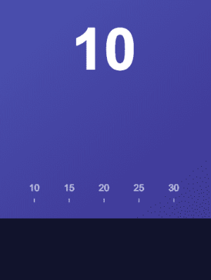
.upper-container { position: relative; background: linear-gradient(to bottom right, #5564c2, #3a2e8d);}.lower-container { background-color: #12132c;}The position: relative property set in the upper-container will be of use when we tray to position its inner elements.

We’re just getting warmed up.
The numbers inside the upper section seem like the logical next step.
<!-- inside .upper-container --><h2 class="temperature-text">10</h2>This will be the big number that shows the current temperature, let’s use some CSS to position it better:
.temperature-text { position: absolute; bottom: 150px; font-size: 100px; width: 100%; text-align: center; user-select: none;}The user-select: none property should helps us to avoid selecting the text when we interact with the slider.
Before we adding the numbers that appear below, let’s fire up the Vue instance with some data to help us avoid repeating unnecessary markup elements:
new Vue({ el: "#app", data: { temperatureGrades: [10, 15, 20, 25, 30], },});Now we can use that temperatureGrades array to show those elements in the design:
<!-- just after .temperature-text --><div class="temperature-graduation"> <div class="temperature-element" v-for="el in temperatureGrades" :key="el"> <span class="temperature-element-number">{{el}}</span><br /> <span class="temperature-element-line">|</span> </div></div>Notice that we are rendering for each of the numbers a | character, now we can style them to look like a “ruler”.
For both the numbers and lines we need to center the text, we will do that inside the temperature-element rules. We will also make the elements to be inline-blocks so they can be next to each other. Finally the | character needs to be smaller, font-size will take care of that:
.temperature-element { text-align: center; display: inline-block; width: 40px; margin: 0 10px 0 10px; opacity: 0.7;}.temperature-element-line { font-size: 7px;}Inspecting the .temperature-graduation element we can see that it’s width is 300px, in order to center it we can use a calculated value in the following way:
.temperature-graduation { position: absolute; left: calc(50% - 150px); // subtracting half the width to center bottom: 25px; user-select: none;}We also set the bottom property to make it appear just above the lower section.
The slider
The upper part is ready, now we will add the slider control. The button is easy, we just need a div with an icon in it:
<!-- inside .lower-container --><div class="slider-container"> <div class="slider-button"> <i class="fas fa-thermometer-empty slider-icon"></i> </div></div>Now let’s style the button, most of the following CSS code are values “tweaked” by hand to be able to position the elements in the desired position.
.slider-container {  width: 150px;  height: 80px;  margin-top: -30px;  margin-left: calc(50% - 187px);  position: relative;}.slider-button {  position: absolute;  left: 42px;  top: 5px;  width: 50px;  height: 50px;  border-radius: 50%;  background-color: #2724a2;
  cursor: grab;  cursor: -webkit-grab;  cursor: -moz-grab;}
.slider-icon {  margin-top: 16px;  margin-left: 21px;  color: white;}
The grab values inside the button will transform the cursor to be a hand when hovering it.
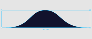
The slider now is only missing a “wave” like shape, at first I tried to do it by using border-radius values and rotating a div, but sadly it didn’t match the design. What I ended up doing was a SVG graphic that looks like this:
The code for that shape is this:
<!-- inside .slider-container --><svg width="150" height="30" viewBox="0 0 150 30" fill="none" xmlns="http://www.w3.org/2000/svg"> <path d="M74.3132 0C47.0043 2.44032e-05 50.175 30 7.9179 30H144.27C99.4571 30 101.622 -2.44032e-05 74.3132 0Z" transform="translate(-7.38794 0.5)" fill="#12132C" /></svg>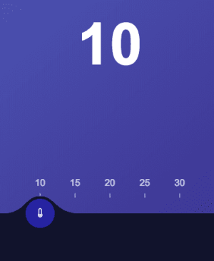
It’s been a bit of a ride, but we have the design ready.
The interaction
The most noticeable thing in the interaction of this widget is, by far, dragging and dropping the slider. We have done this before when we did the card slider, so I’ll follow a similar approach:
// inside data dragging: false, initialMouseX: 0, sliderX: 0, initialSliderX: 0These will be the data properties that will help us to keep track when the user starts/stops dragging, mouse and the slider position.
The following methods will initialize those variables when the user interacts:
// after data methods: { startDrag (e) { this.dragging = true this.initialMouseX = e.pageX this.initialSliderX = this.sliderX }, stopDrag () { this.dragging = false }, mouseMoving (e) { if(this.dragging) { // TODO move the slider } } }Now let’s bind them to the template
<div id="app" class="main-container" @mousemove="mouseMoving" @mouseUp="stopDrag"> <!-- ... inside .slider-container <div class="slider-button" @mouseDown="startDrag">You might have noticed that the @mouseDown action is set in the slider button, but the @mouseMove and @mouseUp are at the level of the main div.
The reason behind this is that users will start by pressing down the slider button, but when moving the cursor they usually get outside the slider track, and if they let go the mouse outside the button it won’t be tracked and will cause the button to follow you until you click it again.
Let’s now fill the mouseMoving method with an algorithm that will set the sliderX property to the desired position. We will need to declare some constrains for the slider to match the ruler we did before.
// before the Vue instanceconst sliderMinX = 0const sliderMaxX = 240
  // inside mouseMoving method    // replace the "TODO" line with this:    const dragAmount = e.pageX - this.initialMouseX    const targetX = this.initialSliderX + dragAmount
    // keep slider inside limits    this.sliderX = Math.max(Math.min(targetX, sliderMaxX), sliderMinX)
  // after methods  computed: {    sliderStyle () {      return `transform: translate3d(${this.sliderX}px,0,0)`    }  }
The computed property sliderStyle as you might have guessed, stores the position for the slider, we just need to bind it to the .slider-container:
<div class="slider-container" :style="sliderStyle"></div>We almost have a working slider control but it is missing an important thing, tracking the slider value. It might sound complicated, but we can calculate that value with a computed property because we already know the sliderX position:
// inside computed currentTemperature () { const tempRangeStart = 10 const tempRange = 20 // from 10 - 30 return (this.sliderX / sliderMaxX * tempRange ) + tempRangeStart }You can se that it works by render it inside the .temperature-text element:
<h2 class="temperature-text">{{currentTemperature}}</h2>
The problem now is that it is rendering float numbers. We can avoid that with a filter:
// after data filters: { round (num) { return Math.round(num) } },And now we can use the filter like this:
<h2 class="temperature-text">{{currentTemperature | round}}</h2>The finishing touches
We could call it a day and let the widget like this, but it is still missing a couple of details. The background should change colors when the temperature goes above 25 degrees, and also the ruler numbers should move in a wave like manner.
For the background we’ll declare a couple of constants at the top and some new data properties:
const coldGradient = {start: '#5564C2', end: '#3A2E8D'}const hotGradient = {start:'#F0AE4B', end: '#9B4D1B'}
// inside Vue    // inside data      gradientStart: coldGradient.start,      gradientEnd: coldGradient.end
    //inside computed      bgStyle () {        return `background: linear-gradient(to bottom right, ${this.gradientStart}, ${this.gradientEnd});`      }
They will hold the colors needed for the gradient background. The bgStyle computed property will generate the background every time gradientStart and gradientEnd change. Let’s bind it to it’s corresponding HTML element:
<div class="upper-container" :style="bgStyle"></div>For now it should look the same, but that will change when we add the rules to animate it inside the mouseMoving method:
// set bg colorlet targetGradient = coldGradient;if (this.currentTemperature >= 25) {  targetGradient = hotGradient;}
if (this.gradientStart !== targetGradient.start) {  // gradient changed  TweenLite.to(this, 0.7, {    gradientStart: targetGradient.start,    gradientEnd: targetGradient.end,  });}
What we are doing is change the gradient values from the cold to the hot ones, when the temperature changes to be 25 degrees or more. The transition is done with TweenLite instead of CSS transitions, because they only work with solid colors.
Finally our rulers elements need to change their Y position if the slider is close to them.
<div class="temperature-element" v-for="el in temperatureGrades" :style="tempElementStyle(el)" :key="el"></div>Similarly to the upper section we’ll bind the style to be changed by a method, this method will receive each of the ruler’s values. Now it’s just a matter of doing some math to calculate the distance and generate some CSS transform props:
  // inside methods    tempElementStyle (tempNumber) {      const nearDistance = 3      const liftDistance = 12
      // lifts up the element when the current temperature is near it      const diff = Math.abs(this.currentTemperature - tempNumber)      const distY = (diff/nearDistance) - 1
      // constrain the distance so that the element doesn't go to the bottom      const elementY = Math.min(distY*liftDistance, 0)      return `transform: translate3d(0, ${elementY}px, 0)`    }
And now the final result!
That’s it for this Widget of the Week.
If you’re hungry for more you can check other WotW: