Minimalist nav menu with Vue.js and GSAP - WotW
March 28, 2019
Welcome to the Second Season of the Widget of the Week series, where I take gifs or videos of awesome UI/UX components, and bring them to life with code.
It’s been a long time since my last post. I had been busy with some projects (that includes having a baby girl), but I’m back with more knowledge and widgets.
Today we are going to create a minimalistic navigation menu, that animates when hovering an option. The inspiration comes from this submission created by Zhenya Rynzhuk and looks like this:

Who is this for?
This tutorial is aimed at front-end developers that want to level up their skills. It is recommended that you have some prior knowledge of HTML, CSS, JS. I’ll be using Vue.js to make the widget, if you’re not familiar to this framework these awesome posts can help you get up to speed:
Preparations
For today’s widget, we will be using Vue.js, and for some animations, we’ll use TweenMax. If you want to follow along you can fork this codepen template that already has the dependencies.
Matching the look
The first thing I want to do with this component is to match the design. probably this will be the easiest part since there are no complicated graphics that will need SVG or icons.
Inside our app node, I will start by creating the markup for the menu. Since it is going to be a navigation menu we should use the semantically correct HTML nodes:
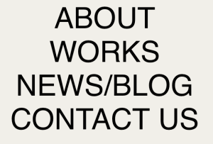
<!-- HTML --><div id="app"> <nav> <ul> <li class="menu-item">About</li> <li class="menu-item">Works</li> <li class="menu-item">News/Blog</li> <li class="menu-item">Contact us</li> </ul> </nav></div>I’m adding class="menu-item" to style the container and the items of the menu in the next step. Also id="app" will be used later to add functionality and animation with Vue.js.
The menu is looking really ugly right now, let’s change that:
/* CSS */body {  background-color: #f1f0e9;}
.menu-item {  font-size: 5em;  list-style: none;  text-transform: uppercase;  font-family: sans-serif;  text-align: center;  cursor: pointer;}
Now we should have something like this:
Let me explain the most crucial rules…
list-style: none;is helping to remove the bullets from the list.text-transform: uppercase;is useful when we don’t want to explicitly “YELL” at users with screen readers, and we just want to show uppercase characters for design purposes.cursor: pointer;makes the mouse behave like each of the elements was a link.
Set up Vue.js
Before getting into more details let’s add Vue.js to the component to be able to render dynamically the menu items.
// JSconst itemsList = ["About", "Works", "News/Blog", "Contact us"];
new Vue({  el: "#app",  computed: {    menuItems() {      return itemsList.map((item, index) => {        return {          label: item,        };      });    },  },});
I’m adding the elements as computed properties of a constant, instead of data inside my component because I need to bind them to my template, but they aren’t going to change over time.
Now that we have the items as a list, and they are ready to be used as a computed property, we can simplify our template to render all menu items with a v-for:
<!-- HTML - inside div > nav > ul --><li v-for="(item, index) in menuItems" :key="`item-${index}`" class="menu-item"> {{item.label}}</li><!-- remove all other "li" elements -->Right now we should have the same elements, just bound to our Vue.js instance.
Hovering and animating
The menu animations in the reference can be broken down into two, the first one consists of moving the menu item to the left and the second one is the characters flipping over.
Let’s start with the first one, moving the menu below the mouse cursor to the left. For that we will add a @mouseover event to the menu items that will trigger a function called selectedItem() that we haven’t declared yet:
<!-- HTML inside nav > ul --><li v-for="(item, index) in menuItems" :key="`item-${index}`" @mouseover="selectItem(index)" class="menu-item"> {{item.label}}</li>Now for the selectItem() method, we want to keep track of the hovered item so we will add inside the component data a selectedItem variable. This property will start at -1 for no item selected and will change it’s value to the index of the selected button when hovered.
// JSnew Vue({ el: '#app', data: { selectedItem: -1 }, methods: { selectItem(id) { this.selectedItem = id; } }, // ... the rest of our componentTo see the selectedItem changing you can add in your template the next line:
<!-- HTML after </nav> --><p>selectedItem: {{ selectedItem }}</p>Knowing which button is currently selected will let us add a class to “move” our button. To do this we can add a selected property to our computed menuItems like this:
// JS inside computedmenuItems () { return itemsList.map((item, index) => { const isSelected = this.selectedItem === index; return { label: item, selected: isSelected } })}and in the HTML make use of that new property:
<!-- HTML inside nav > ul --><li v-for="(item, index) in menuItems" :key="`item-${index}`" @mouseover="selectItem(index)" :class="{'selected': item.selected}" class="menu-item"> {{item.label}}</li>Notice there are two class attributes, they concatenate instead of overriding each other. When “item.selected” is “true”, that menu item will have both the “menu-item” and the “selected” classes.
Let’s add the CSS class to handle the movement:
/* CSS */.menu-item {  /* ... previous styles */  transition: margin-left 0.5s ease-out, opacity 0.5s ease-out;}
.selected {  margin-left: -90px;}
The transition attribute indicates that any change to that value should be animated.
We are almost done with this part, there’s something missing tho. After moving our mouse outside all of the elements, the last one stays selected, and we don’t want that. To fix that we can use the @mouseleave event:
<!-- HTML inside nav > ul --><li v-for="(item, index) in menuItems" :key="`item-${index}`" @mouseover="selectItem(index)" @mouseleave="selectItem(-1)" :class="{'selected': item.selected}" class="menu-item"> {{item.label}}</li>Adding the arrow and dim other items
Before getting into the animation of the characters there are still a couple of details, there should be an arrow appearing for the selected item, and also non-selected items should be dimmed or semi-transparent.
Let’s quickly add an arrow character to our menu items.
<!-- HTML inside nav > ul --><li v-for="(item, index) in menuItems" :key="`item-${index}`" @mouseover="selectItem(index)" @mouseleave="selectItem(-1)" :class="{'selected': item.selected}" class="menu-item"> {{item.label}} <span class="arrow">➔</span></li>The arrow looks a little different from the reference since it is a regular ➔ character instead of a vector that matches exactly the design, but it is good enough for our purposes.
We want to hide all the arrows unless they are a child of a selected item, we can do this with CSS rules similar to what we did before with the selected items:
/* CSS */.menu-item > .arrow {  opacity: 0;  transition: opacity 0.7s ease-out;}
.selected > .arrow {  opacity: 1;}
Now that the arrows appear and disappear, let’s dim the unselected items. We can compute the dimmed items just as we did with the selected one:
// JS inside computedmenuItems () { return itemsList.map((item, index) => { const isSelected = this.selectedItem === index; const otherButtonIsSelected = this.selectedItem !== -1 return { label: item, selected: isSelected, dimmed: !isSelected && otherButtonIsSelected } })}… add the .dimmed class to the items in our HTML:
<!-- HTML inside nav > ul --><li v-for="(item, index) in menuItems" :key="`item-${index}`" @mouseover="selectItem(index)" @mouseleave="selectItem(-1)" :class="{ 'selected': item.selected, 'dimmed': item.dimmed }" class="menu-item"> {{item.label}} <span class="arrow">➔</span></li>… and last but not least, create the .dimmed CSS rule:
/* CSS */.dimmed { opacity: 0.3;}We are getting closer to the final product.

Character flipping animations
Flipping each of the menu item characters is probably the most interesting and complicated part in this widget. We can’t just flip over the whole menu, each one of the characters should be individually flipped over horizontally (scaleX: -1).
To be able to “control” each and every character we need to split the menu characters:
// JS inside computedmenuItems () { return itemsList.map((item, index) => { const isSelected = this.selectedItem === index; const otherButtonIsSelected = this.selectedItem !== -1 return { label: item, selected: isSelected, dimmed: !isSelected && otherButtonIsSelected, chars: item.split('') } })}…with the chars property we can now render each character inside a <span> node:
<!-- HTML inside nav > ul --><li v-for="(item, index) in menuItems" :key="`item-${index}`" @mouseover="selectItem(index)" @mouseleave="selectItem(-1)" :class="{ 'selected': item.selected, 'dimmed': item.dimmed }" class="menu-item"> <span class="char" v-for="(char, charIndex) in item.chars" :key="`char-${charIndex}`" :ref="`char-${index}-${charIndex}`" >{{char}}</span > <span class="arrow">➔</span></li>Take note of the “ref” attribute, it will help us to “reference” all of those characters using the “index” of the menu item along with the “charIndex”.
At this moment nothing should have changed visually, but we should have just separated the menu into characters.
We will add a couple of constants that will help us to read better the next part of our code
// JS below const itemList declarationconst LEFT = -1;const RIGHT = 1;After that, whenever the selectedItem changes, we want to start animating correctly all of the characters. We will loop through each menuItem and depending on if they’re selected or not we will flip them LEFT or RIGHT:
// JS inside methodsselectItem(id) {  this.selectedItem = id;
  this.menuItems.forEach((item, index) => {    const direction = item.selected ? LEFT : RIGHT;    this.animateChars(index, item.label.length, direction);  })},
The animateChars() method is not declared yet, but now it shouldn’t be hard to create since we have the index of the item, the number of characters that the item has and the direction to flip the letters:
// JS inside methodsanimateChars (id, charLength, direction) { for(let c=0;c < charLength; c++){ const refId = `char-${id}-${c}`; const char = this.$refs[refId]; TweenMax.killTweensOf(char); TweenMax.to(char, 0.5, {scaleX: direction}); }}In this method we are basically getting the reference for each of the characters, killing the animation the currently have (if any) and then flipping the character to the direction we previously calculated.
It seems that everything should be looking just like the reference, but it doesn’t 😰.
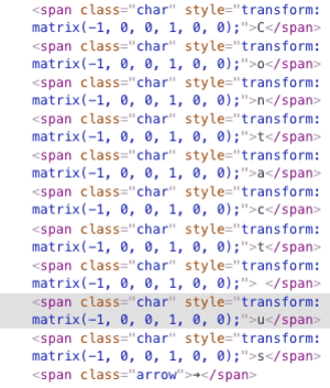
If we look into the console we will see that the characters are being transformed correctly, TweenMax is changing their transform matrix just as I expected:
After scratching my head for a while and looking for any bug I found out that the <span> nodes we are animating, by default have their display property set to inline. Transforms don’t seem to work with that type of display property so let’s take advantage of the .char class that we added to those elements to fix this:
.char { display: inline-block; min-width: 0.3em;}The “min-width” property was added to make the text look correctly, when adding the “inline-block” display property, the characters like spaces lose their width.
And now the final result!
I know there is room for improvement, sometimes animations don’t run smoothly because of all the different elements rendering. If you have any ideas on how to improve this I’d love to read them in the comments.
And that’s it for this Widget of the Week.
If you’re hungry for more you can check other WotW: